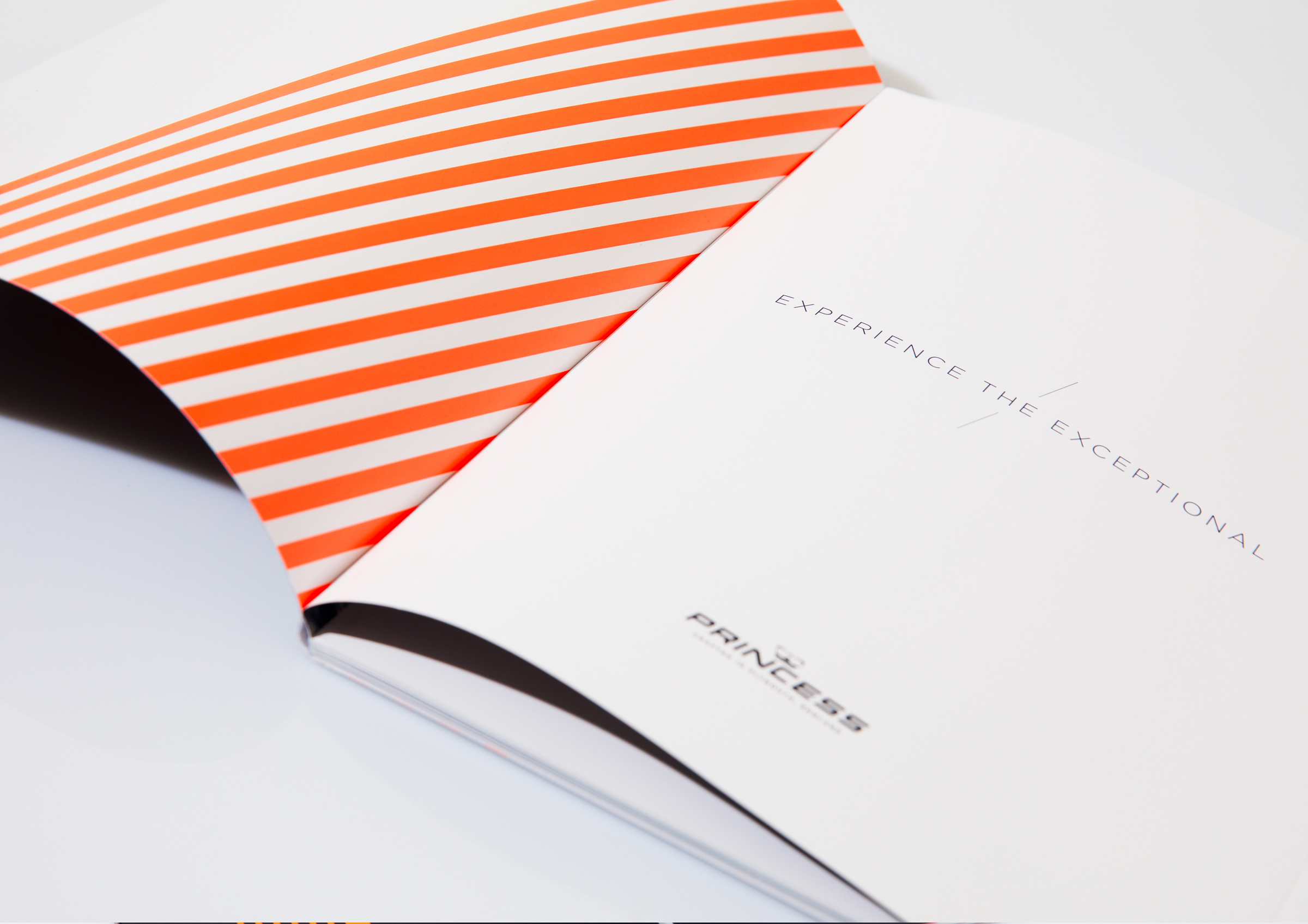
Princess Yachts is a global luxury yacht builder which resides in Plymouth, England. They came to us for a new brand concept and pay-off. We actually delivered them two pay-offs and a stunning brand campaign. The overarching brand pay-off became: Experience the exceptional. Every Princess yacht is designed with a forward-thinking mentality and crafted with meticulous attention to detail. On that level as well as on an emotional level once you own a yacht it delivers an exceptional experience. We also introduced: Crafted in Plymouth, England to sign off with their strong roots from a historically rich maritime city.
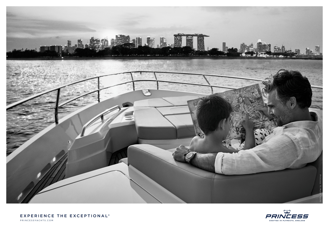
Yacht advertising is surprisingly generic, with lots of pictures of boats but no one showing what it means to experience one. So we did. First we developed a new brand pay off ‘Experience the Exceptional’ then we implemented it with this print campaign. The images were shot by great photographer Roger Neve and his team.


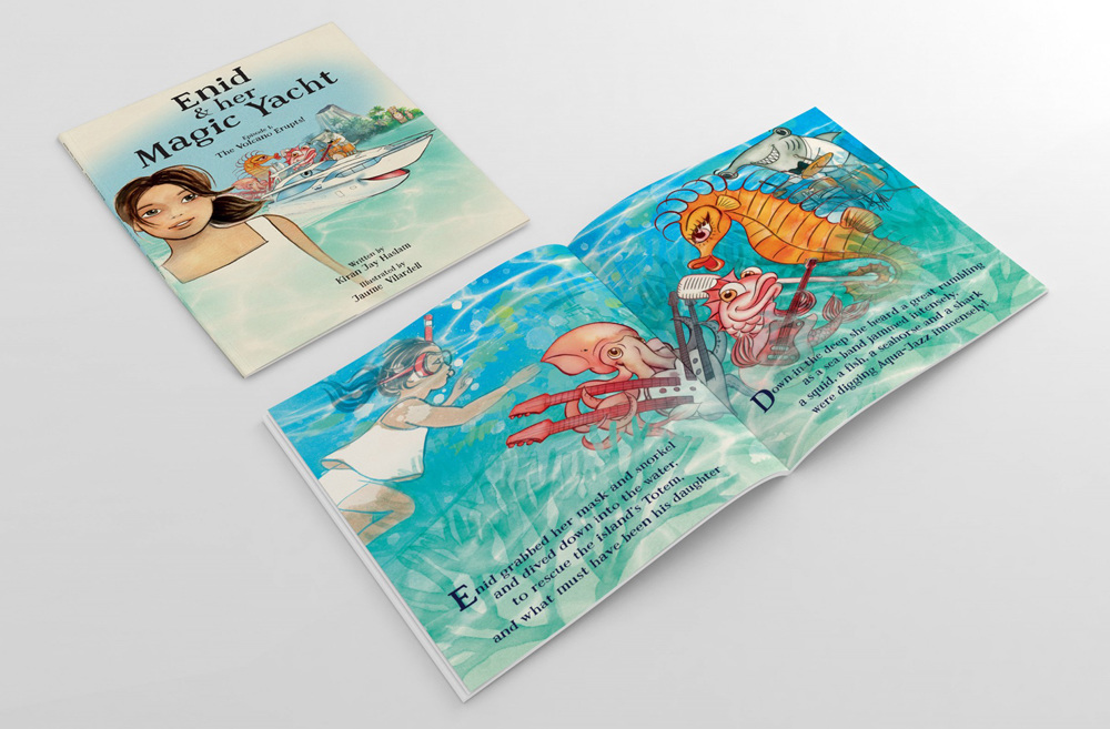
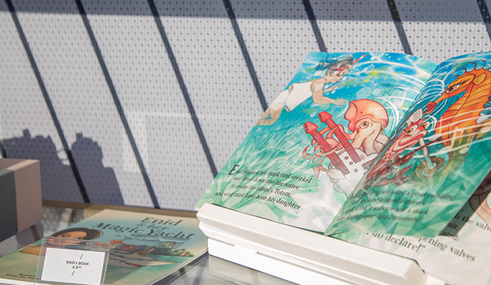
CHILDREN'S BOOK
We also developed a world first - a children's story book, purposely created to be read at sea.
The book features in the Father & Son ad. All proceeds are donated to The Marine Conservation Society.
It's the first time a yacht manufacturer has partnered with Marine Conservation.
llustrated by: Jaume Vilardell

Experience the exceptional - Exceptional People
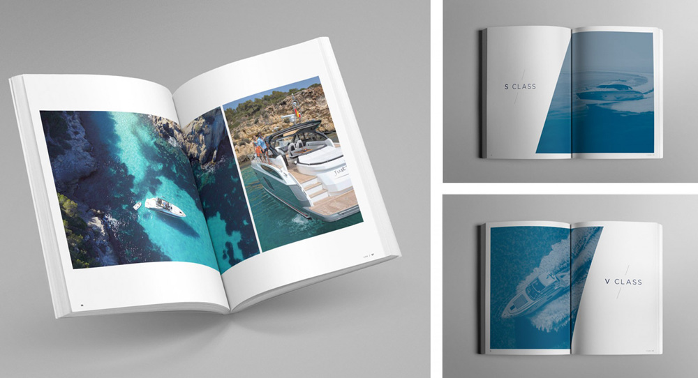
Experience the exceptional - Classes
The introduction of the renewed Princess V Class range that would get heads turning. Both in real life as on screens.

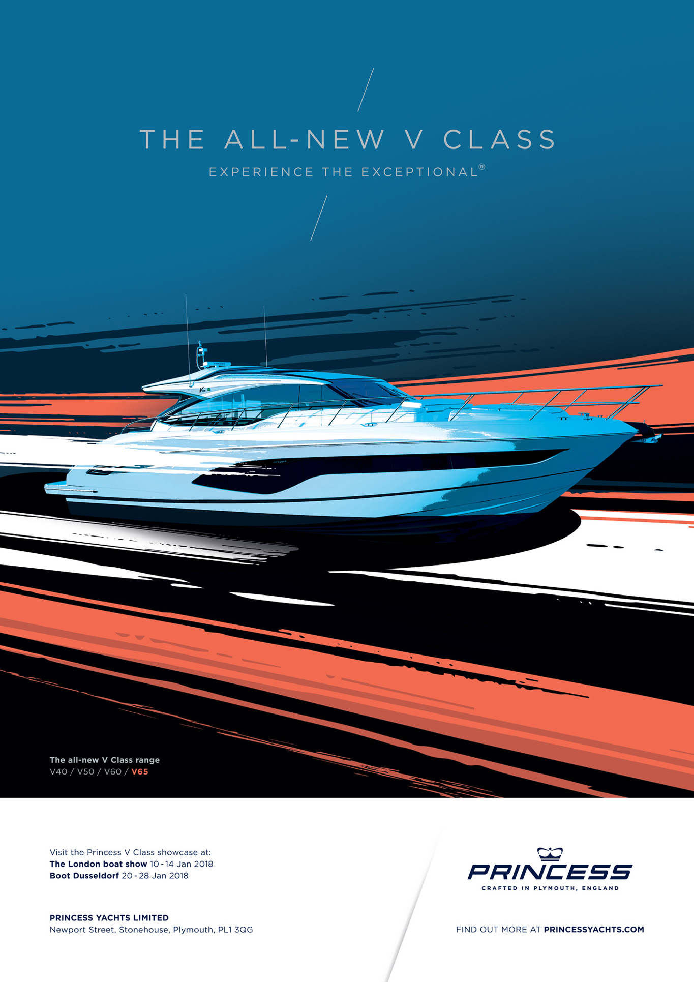
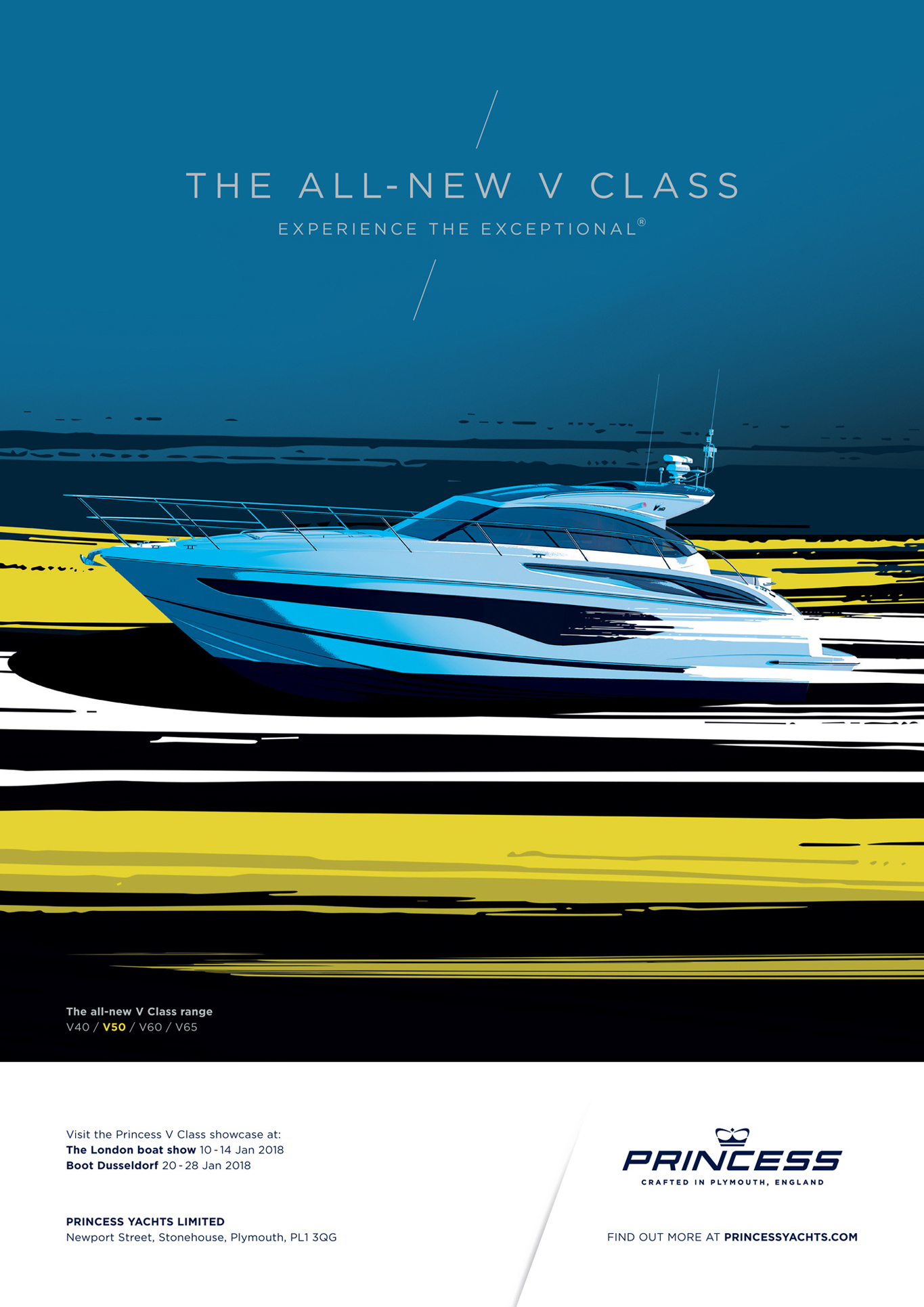
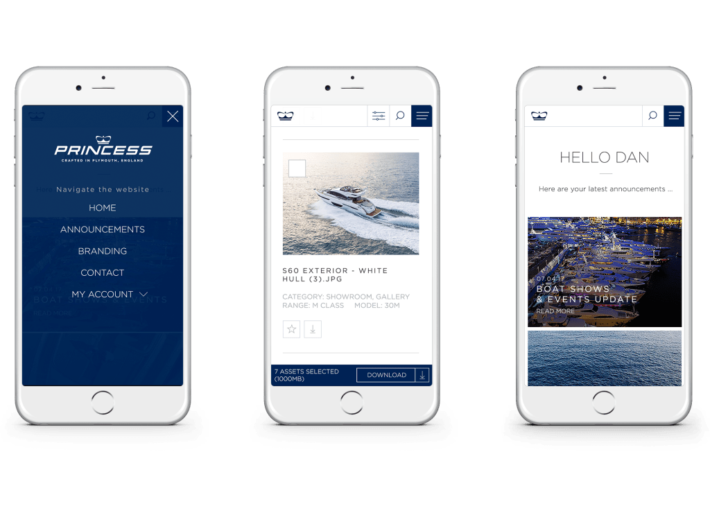
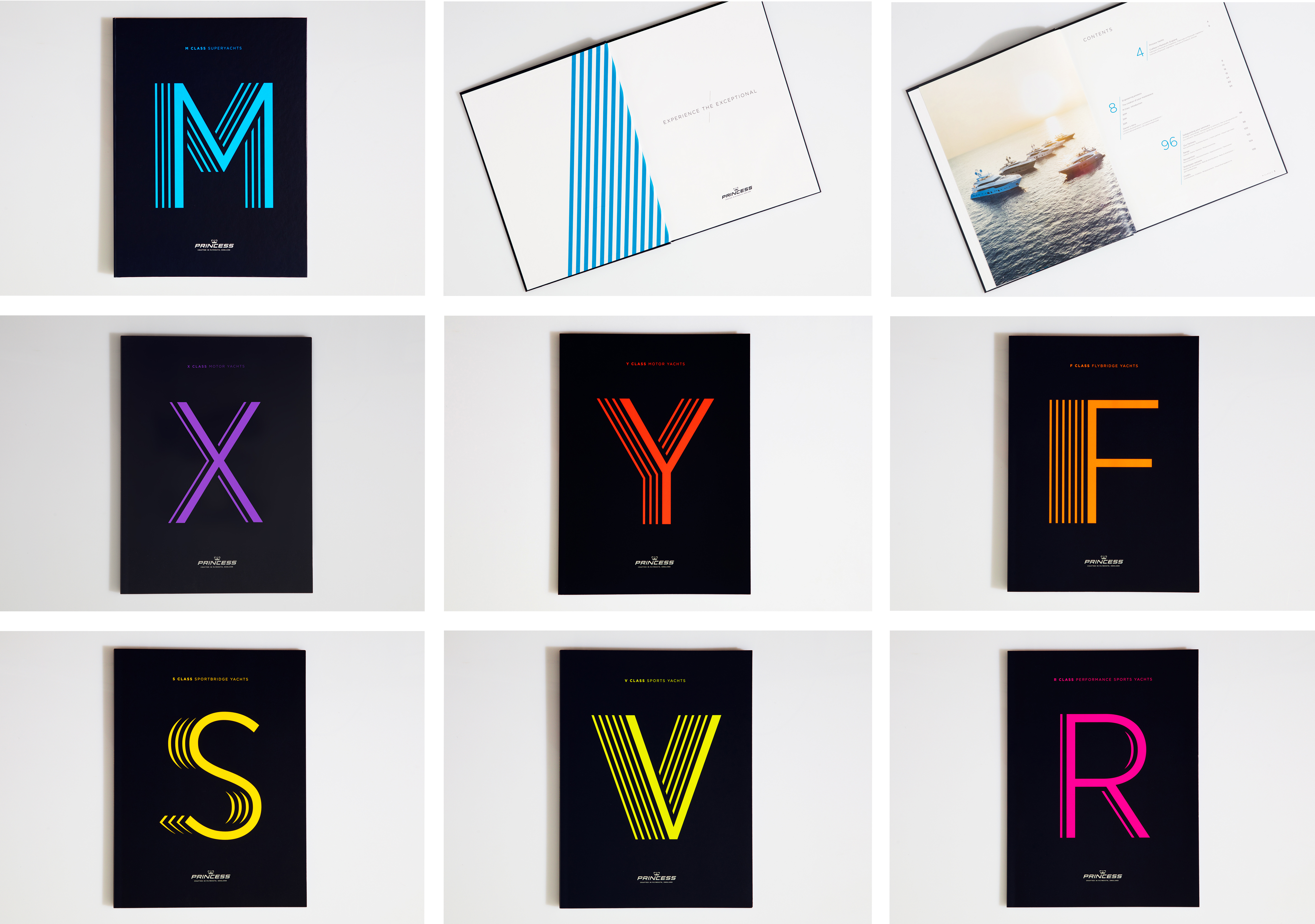
We introduced a completely new brand identity for Princess Yachts. The forward line in the design would come back in many shapes and forms (brochures, events, internal branding etc), all linked to the forward angle the Princess logo was designed in. The different classes were identified by the different blue sea colors. White space in each design shows the calm and expresses the subject in a more premium way.
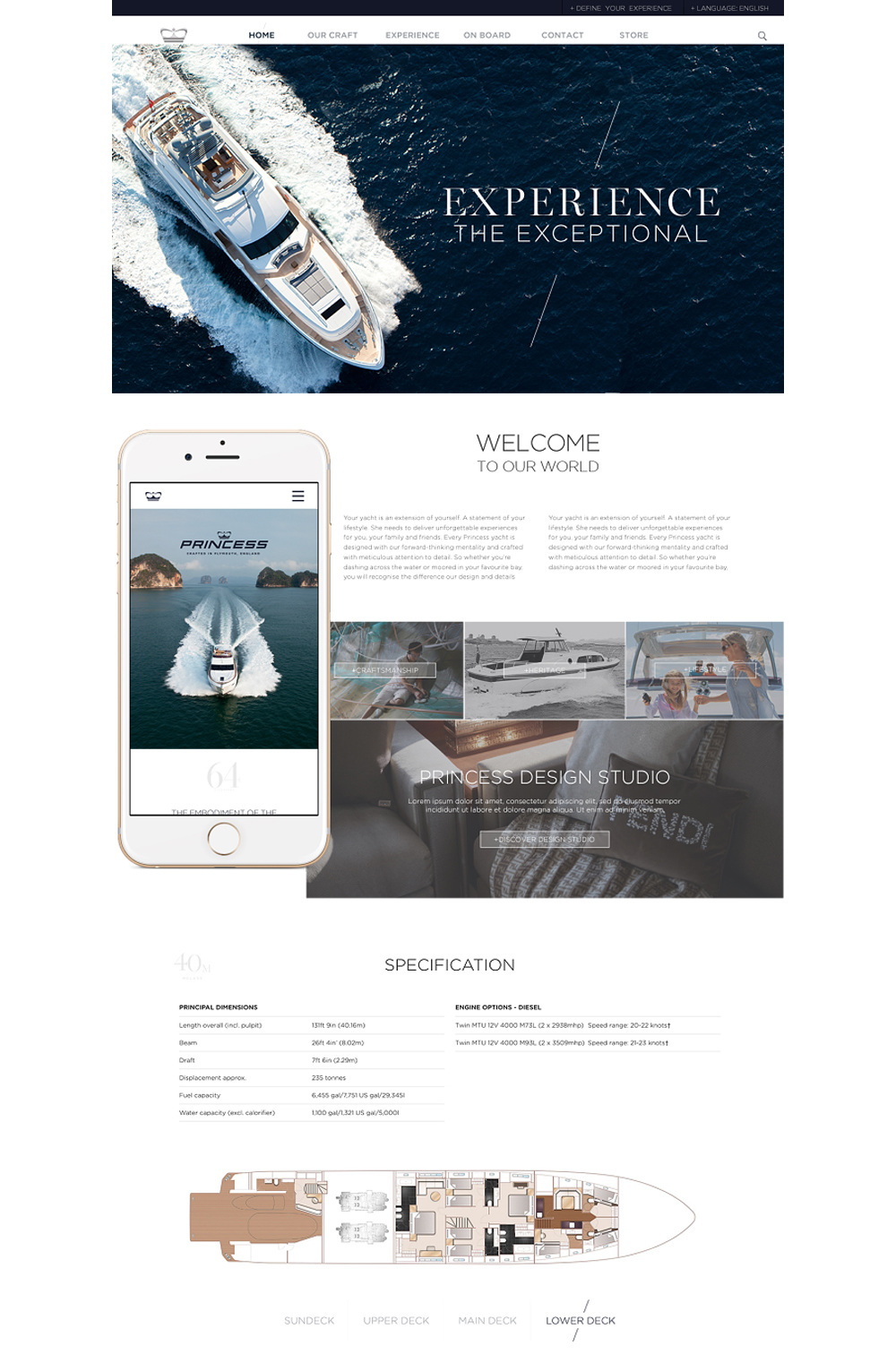

Three years on from designing our first identity for Princess Yachts, it was time for an ‘exceptional’ refresh.
For each class we created a unique logotype in neon. These were created by representing the amount of boats in each class through shadow lines behind the class letter. These lines follow through across brand assets.
︎
Agency: BSUR
Design and production: BSUR